Free Digital Marketing Review
Elevate your online strategy with a personalised report and expert insights. Achieve your business goals faster!
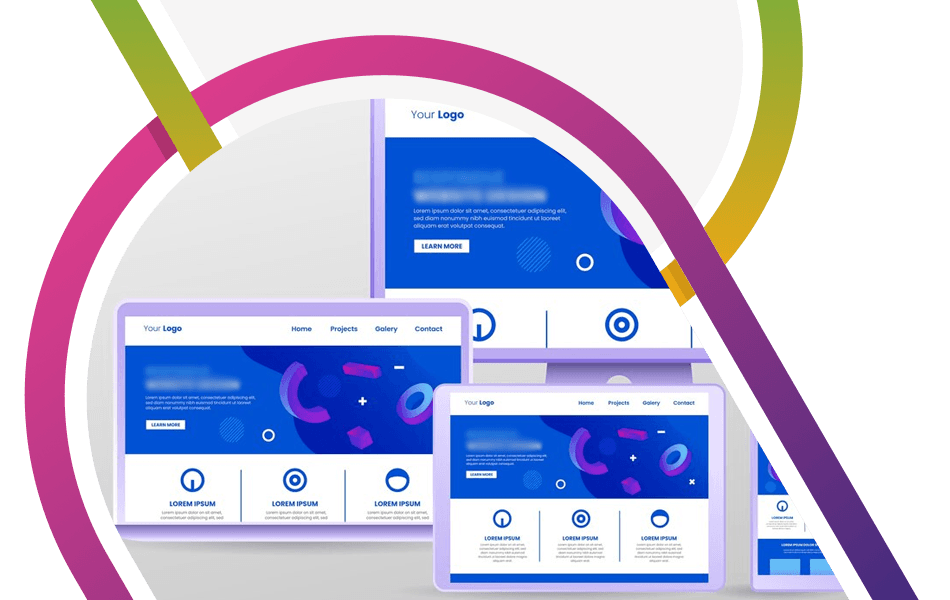
Landing Page Design – Best Practice
What Is a Landing Page (and Why It Matters)
At its simplest, a landing page is a dedicated web page designed to drive visitors to complete an action. This action can range from signing up for a newsletter to downloading a price guide or booking an appointment.
What are the essential elements of great landing page design?
The Key to the success of a great landing page design is the thought process involved before a design has even been considered.
What are the key areas of consideration?
- Who is the customer? (Age range, Sex, Demographic)
- How will the customer access the landing page? (desktop, laptop, PC/Mac, mobile, tablet)—best practice is to design for a mobile-first audience. However, this does come with some compromises that you might want to change/test on desktop, for instance.
- What type of connection are people using? (Leased line, broadband, mobile (3G/4G/5G). Demographics will often skew this
- Which country, region, or location are the potential customers coming from
- Is the user working and carrying out a business-to-business search or a personal search (business-to-consumer)?
Why does the above matter so much? – Simply put, it should influence the design, imagery, messaging, and potential customers’ pain points or desires.
Why First Impressions Matter
Always focus the design and copy to deliver a compelling above-the-fold proposition. (Sadly, we would love for people to scroll down your page to read all the lovely content we have written, but that is not always the case. Keeping the core message and call to action (CTA) above the fold is key.
Use contrasting CTA Design
Use bold, high-contrast colours (e.g., bright orange against a muted background) to ensure your CTA stands out.
Repetition
Repeat the primary CTA after significant content sections. Avoid cluttering the page with competing elements and overlays.
Minimalist Layout
Do not include navigation menus as these distract the user; the only situation where these should be used is if they link to anchors further down the page. Reduce distractions – don’t include imagery for its own sake.
Images & Videos
Professionally shot photos or explainer videos boost credibility and convey messages faster than text. For instance, product demos or customer testimonials in video form increase trust. The only consideration here is what we discussed at the start. What tech are people using, and what connectivity?
Responsive Design
Mobile optimisation is non-negotiable:
86% of top-performing landing pages are optimised for mobile devices, reflecting the dominance of mobile traffic.
Consistent experience across devices:
Responsive design ensures content and elements automatically scale to fit any screen, eliminating the need for users to zoom, scroll excessively, or struggle with navigation.
Custom graphics
Use icons or illustrations to simplify complex ideas whilst aligning with brand identity.
Messaging That Converts: Headlines, Copy & CTA’s
- Persuasive, benefit-driven copy is key, as are strong calls-to-action.
- Clarity: Use concise, benefit-driven language (e.g., “Download Your Free Guide” instead of “Click Here”).
- Urgency: Incorporate time-sensitive phrasing like “Limited Time Offer” or “Join Now” to encourage immediate action
- Headline/Sub headline: Mirror the CTA’s value proposition (e.g., “Boost Productivity with Our Free Tool” paired with a “Start Free Trial” button).
- Supporting Elements: Use testimonials, stats, or visuals that reinforce the CTA’s credibility (e.g., “Join 10,000+ Happy Users”).
Trust Signals: Social Proof, Testimonials & Logos
Trust Badges & Security Seals
To alleviate transaction concerns, display SSL certificates, payment security icons, and guarantees (e.g., “30-Day Money-Back”) near CTA’s.
Customer Reviews & Star Ratings
Showcase verified testimonials and product-specific ratings to validate quality. Platforms like Trustpilot or Google Reviews embedded in product sections can boost credibility.
Social Proof & User-Generated Content
Customer Logos: Feature recognisable client brands
Live Counters: Show real-time user activity (e.g., “1.4M businesses use Our Payroll Software”) to create urgency.
How to set up forms within your landing page design
If you get your form right you can dramatically increase your conversion rate. Its therefore key that you consider the following:
- Keep forms as short as possible.
- Only ask for information you genuinely need. Each additional field can reduce conversion rates, so focus on essentials like name and email unless the offer justifies more detail.
- Users may expect to provide more information for more complex offers (e.g. mortgages), but always explain why it’s needed.
- Use Multi-Step Forms for Longer Processes
- If you must collect more data, break the form into multiple steps. Start with easy questions to build momentum and reduce perceived effort.
- Use progress indicators to show users how far they’ve come, which can increase completion rates.
Performance (Page Speed)
Fast load times are essential. A delay of just one second in page load time can reduce conversions by 7%. More than half of mobile users (53%) will abandon a page if it takes longer than three seconds to load.
Quick-loading pages reduce bounce rates and keep users engaged, making them more likely to complete desired actions.
Testing, Tweaking & Tracking: The Role of A/B Testing
A/B testing (or split testing) involves creating two or more versions of a landing page—typically a control (A) and a variation (B)—with a single element changed between them, such as the headline, CTA button, imagery, or layout. Traffic is split between these versions, and their performance is measured to determine which version achieves better results, such as higher sign-ups or sales.
What to A/B Test?
The following are commonly tested aspects of landing page design.
- Headlines and subheadings
- Call-to-action (CTA) buttons (colour, text, placement)
- Images and videos
- Page layout and design
- Social proof and testimonials
- Form length and fields
Marketing is a test-and-measure process. Your landing page design should be the same. Following the above guidelines has enabled us to deliver landing pages that convert from 5-15%. The design is key, but equally important is the messaging. Use the following articles about the importance of persuasive language, the benefits of conversion tracking, to further enhance the improvements to your marketing activities.
Need help with your website and marketing?
Book a FREE growth strategy session with our experts
Our award-winning team will review your website and marketing goals to provide you with crucial insight and advice.

4.9 STAR
Google reviews
With 10+ years of experience, Link Digital has helped hundreds of businesses to succeed online. We can help yours too!